Creating an inviting and stylish open living space in Sarasota requires a keen understanding of color schemes that resonate with the local aesthetic. Bold color palettes can transform these spaces, making them not only visually appealing but also reflective of the coastal luxury that Sarasota embodies. In this article, we will explore seven striking color schemes that can elevate your open living areas, enhancing both their beauty and functionality. You will learn how to select colors that harmonize with Sarasota’s unique architecture and climate, as well as how to integrate these hues into your design effectively. We will also discuss the impact of natural light and furnishings on color selection, ensuring that your choices create a cohesive and inviting atmosphere.
What Are the Top 7 Bold Color Palettes for Sarasota Open Living Spaces?
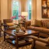
When it comes to designing open living spaces in Sarasota, certain bold color palettes stand out for their ability to enhance the overall aesthetic. Here are seven top color schemes that can elevate your interiors:
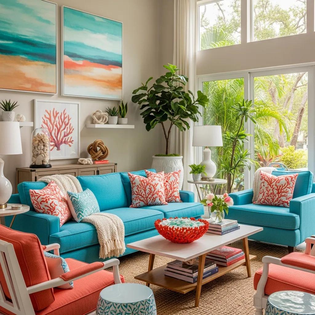
- Turquoise and Coral: This vibrant combination reflects the coastal environment, bringing a refreshing feel to any space.
- Emerald Green and Gold: A luxurious pairing that adds sophistication and warmth, perfect for upscale homes.
- Navy Blue and White: This classic duo offers a timeless elegance, ideal for creating a serene atmosphere.
- Burnt Orange and Cream: A warm palette that adds a cozy touch while maintaining a modern edge.
- Deep Purple and Silver: This rich combination brings a sense of drama and opulence to open spaces.
- Charcoal Gray and Mustard Yellow: A contemporary mix that balances boldness with subtlety, perfect for modern designs.
- Blush Pink and Sage Green: A soft yet striking palette that adds a touch of romance and tranquility.
These color schemes not only enhance the visual appeal of open living spaces but also reflect the vibrant lifestyle of Sarasota.
Further research into regional design principles highlights the importance of integrating diverse materials with bold color choices to accentuate coastal aesthetics.
Bold Coastal Interior Color Schemes
-based analysis of interior color scheme. The definition and materials from southeastern coastal regions, exposed the with diverse materials and bold color choices, accentuating the Evolution of ‘Color’
Elements in Residential Interior Design, Z Yang, 2024
Which jewel tones best complement Sarasota’s coastal luxury homes?
Jewel tones are particularly well-suited for Sarasota’s luxury homes, as they evoke a sense of richness and depth. Here are some jewel tones that work beautifully in this context:
- Emerald Green: This color brings a lush, vibrant feel that complements the natural surroundings.
- Sapphire Blue: A deep, calming hue that mirrors the ocean, perfect for creating a serene atmosphere.
- Ruby Red: This bold color adds warmth and energy, making it ideal for accent walls or furnishings.
- Amethyst Purple: A sophisticated choice that adds a touch of elegance and creativity to any space.
- Topaz Yellow: This bright, cheerful color can illuminate a room, adding a sunny disposition to the design.
Incorporating these jewel tones can enhance the luxurious feel of your home while maintaining a connection to the coastal environment.
Indeed, the careful selection of color schemes by interior designers often draws inspiration from the luxurious ambiance of beach resorts and coastal getaways.
Luxury Coastal Interior Color Schemes
Color schemes chosen by interior designers are carefully chosen to the club holidays that are offered in beach resorts ashore.
Seafaring elegance: the art of cruise interior design, S Kumar, 2024
How do bold color palettes enhance open concept living rooms?
Bold color palettes play a crucial role in enhancing open concept living rooms by creating focal points and defining spaces. These colors can draw the eye and create a sense of flow throughout the area. For instance, a vibrant accent wall can serve as a backdrop for furniture arrangements, while complementary colors can unify different zones within the open space. Additionally, bold colors can influence the perception of space, making it feel larger or more intimate depending on the chosen hues. By balancing bold colors with neutral tones, homeowners can achieve a harmonious look that feels both dynamic and inviting.
Trade Mark Interiors specializes in creating sophisticated open living spaces that combine bold color schemes with functional elegance. Their expertise in luxury interior design ensures that each color choice enhances the overall aesthetic while meeting the unique needs of affluent homeowners in Sarasota.
How Does Sarasota’s Climate and Design Style Influence Interior Color Trends?
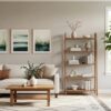
Sarasota’s warm climate and coastal design style significantly influence interior color trends. The abundant natural light in the region allows for brighter colors to shine, making them appear more vibrant and lively. Additionally, the local architectural styles often feature open spaces that benefit from light, airy colors that reflect the surrounding environment. As a result, homeowners are increasingly drawn to colors that evoke a sense of tranquility and connection to nature, such as soft blues, greens, and sandy neutrals. Understanding these influences can help homeowners make informed decisions when selecting color schemes for their interiors.
What regional factors shape Sarasota’s luxury home color schemes?
Several regional factors shape the color schemes of luxury homes in Sarasota. The area’s unique architectural styles, such as Mediterranean and contemporary designs, often dictate color choices that complement these aesthetics. Furthermore, the influence of the coastal environment encourages the use of colors that reflect the natural landscape, such as ocean blues and sandy beiges. Additionally, the local culture and lifestyle play a role, with homeowners often opting for colors that evoke relaxation and leisure. By considering these regional factors, homeowners can create spaces that are not only beautiful but also reflective of their surroundings.
How do natural light and open floor plans affect color selection?
Natural light and open floor plans are critical considerations when selecting colors for interior spaces. The amount of light a room receives can dramatically alter the appearance of colors, making them appear lighter or darker depending on the time of day. Open floor plans benefit from cohesive color schemes that flow seamlessly from one area to another, enhancing the sense of space. Homeowners should consider how colors will interact with natural light throughout the day, ensuring that their choices create a harmonious and inviting atmosphere.
Achieving such harmony is a core principle in interior design, often supported by systematic approaches to color selection.
Interior Design Color Harmony & Selection
Following this approach, a new color selection system is of plate and interior images. As a result, the proposed system, the resultant colors can be more natural in combination with
Color selection in the consideration of color harmony for interior design, 2000
How Can You Integrate Bold Colors with Natural Light and Furnishings?
Integrating bold colors with natural light and furnishings requires a thoughtful approach. Here are some strategies to achieve this balance:
- Use Neutral Backdrops: Start with neutral walls to allow bold colors to stand out without overwhelming the space.
- Incorporate Textures: Use various textures in furnishings and decor to add depth and interest to bold colors.
- Choose Complementary Accents: Select furnishings and accessories that complement the bold colors, creating a cohesive look.
- Consider Lighting: Use layered lighting to enhance the impact of bold colors, ensuring they remain vibrant throughout the day.
By following these strategies, homeowners can create a balanced and inviting environment that showcases their bold color choices.
What strategies balance bold hues without overwhelming open spaces?
Balancing bold hues in open spaces requires careful consideration to avoid overwhelming the design. Here are some effective strategies:
- Limit Bold Colors: Use bold colors sparingly, focusing on key areas such as accent walls or statement furniture.
- Incorporate Neutrals: Pair bold colors with neutral tones to create a sense of calm and balance within the space.
- Create Focal Points: Use bold colors to draw attention to specific areas, such as artwork or architectural features, while keeping other elements subdued.
- Use Patterns Wisely: Incorporate patterns that feature bold colors in moderation, ensuring they complement rather than compete with the overall design.
These strategies can help maintain a harmonious balance in open living spaces while allowing bold colors to shine.
How to combine modern color combinations with luxury materials?
Combining modern color combinations with luxury materials can elevate the overall design of a space. Here are some tips to achieve this blend:
- Select High-Quality Materials: Choose luxury materials such as marble, silk, or high-end woods that enhance the richness of modern colors.
- Layer Textures: Use a variety of textures to create depth, ensuring that modern colors are complemented by tactile elements.
- Incorporate Metallic Accents: Use metallic finishes in fixtures and decor to add a touch of glamour that pairs well with modern color schemes.
- Focus on Cohesion: Ensure that the color palette and materials work together cohesively, creating a unified look that feels intentional and sophisticated.
By thoughtfully combining modern colors with luxury materials, homeowners can create spaces that are both stylish and inviting.
What Are Effective Approaches to Choosing Colors for Large Remodels in Sarasota?
Choosing colors for large remodels in Sarasota requires a strategic approach to ensure a cohesive and appealing design. Here are some effective strategies:
- Understand the Mood: Consider the mood you want to create in each space, as colors can significantly influence emotions and perceptions.
- Limit the Palette: Choose a limited color palette to maintain consistency throughout the remodel, making it easier to coordinate different areas.
- Incorporate Existing Elements: Take into account existing architectural features and furnishings to ensure that new colors complement the overall design.
- Test Samples: Always test paint samples in the actual space to see how they interact with natural light and other elements before making final decisions.
These approaches can help homeowners navigate the color selection process during large remodels, ensuring a successful outcome.
How does interior design consultation tailor bold palettes to client needs?
Interior design consultations play a vital role in tailoring bold color palettes to meet client needs. During these consultations, designers assess the client’s preferences, lifestyle, and the specific characteristics of their space. This personalized approach allows designers to recommend color schemes that not only reflect the client’s taste but also enhance the functionality and aesthetic of the home. By creating concept boards and discussing various options, designers can guide clients through the decision-making process, ensuring that the final color choices align with their vision.
What case studies demonstrate successful bold color projects by Trade Mark Interiors?
Trade Mark Interiors has successfully executed numerous projects that showcase the effective use of bold color schemes. One notable case involved a luxury waterfront home where the designers utilized a combination of deep navy and crisp white to create a sophisticated yet inviting atmosphere. The bold color choice was complemented by high-end furnishings and natural textures, resulting in a cohesive and elegant design. Another project featured a vibrant coral accent wall that served as a focal point in an open living area, enhancing the overall brightness and energy of the space. These case studies highlight the firm’s expertise in integrating bold colors with luxury materials to create stunning interiors that resonate with Sarasota’s coastal lifestyle.
To understand the difference between an interior designer and decorator, Trade Mark Interiors offers insights into their respective roles.